I joined Riverside Unified School District as the Graphic Design and Digital Content Specialist in 2017 and have since worked within the Communications Department to develop tools to empower employees, create district brand standards and solidify our process for effective and strategic communication.
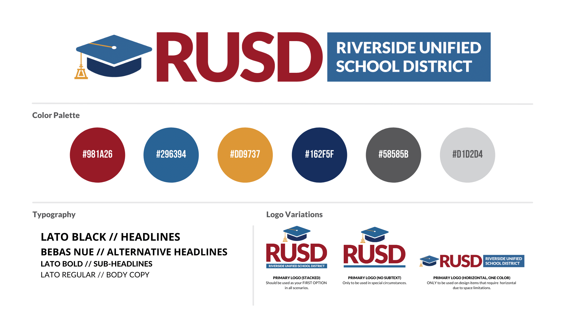
Brand Refresh
Updating the RUSD brand was one of my first missions when hired. There were two main reasons for this: one, the hat icon and typography were co-dependent, limiting the logo variation options, and two, the layered RUSD text and white outline also halted ability to provide variation. See original logo here.
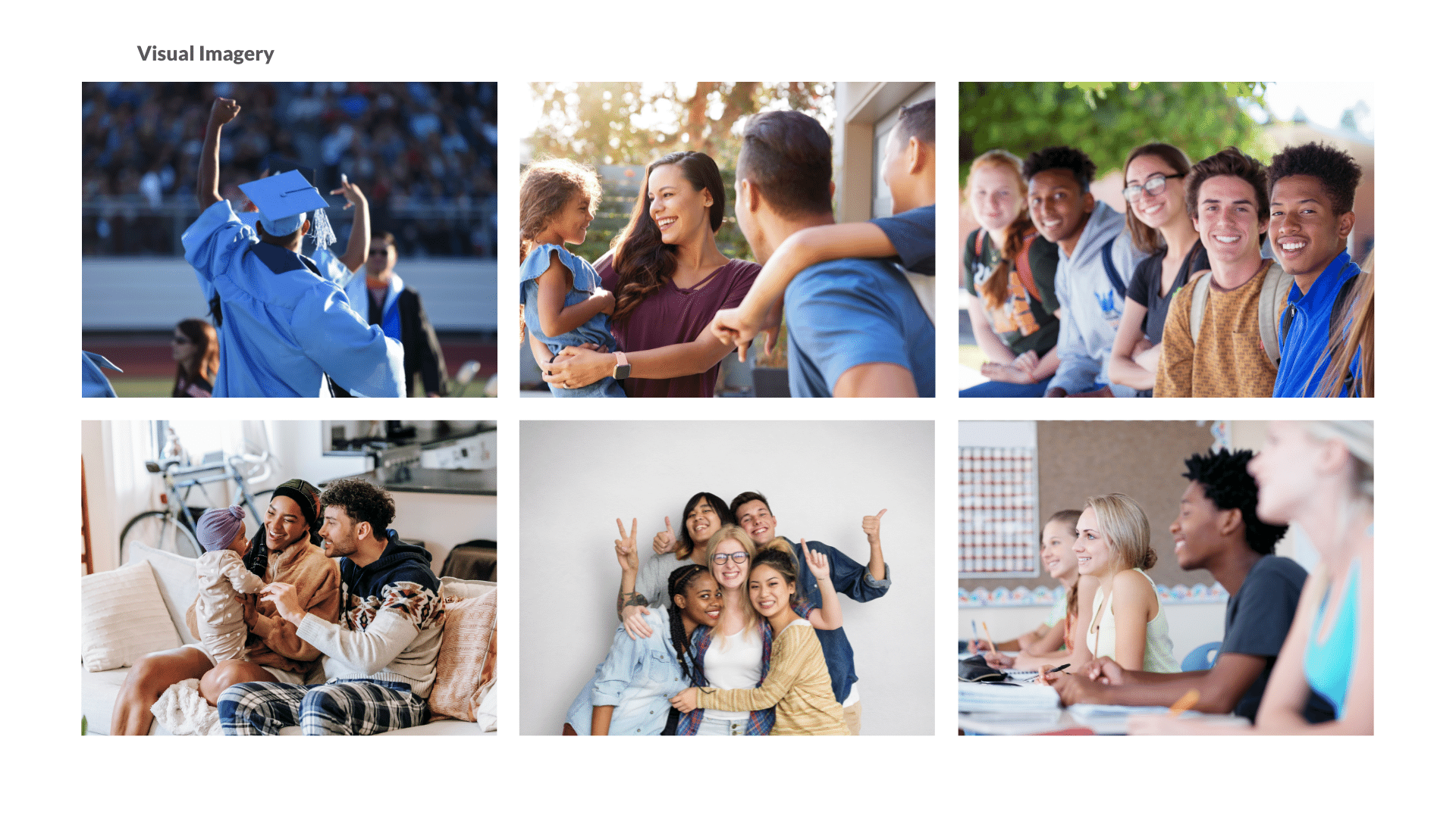
The logo already had community recognition, and because of this, my efforts became focused on a refresh. I expanded the color palette and worked to create a hat icon that could exist on its own and incorporated the rain cross (iconic to Riverside) symbol in a way that visually made sense. Lato was chosen as the primary font for its versatility and soft nature.
UI/UX Website Update
The RUSD website was updated in 2017 from Blackboard to School Messenger. Due to staffing shortages, the site content was migrated but not adequately adjusted to fit the new template. This issue, paired with multiple district staff working on various pages without consistent design standards, brought the need for a UI/UX update into focus. We were able to identify four primary pain points for the overall experience when visiting the homepage.
Pain Point One: Cluttered Homepage
The first pain point to address was the consistent critique of the homepage being too cluttered with too much staff content. The new design simplifies the main navigation, removes staff content to an intranet, and utilizes plain language such as "enroll." The search bar is modified to be more helpful and prominent. The slider graphic and text overlay are adjusted to avoid visual conflict.
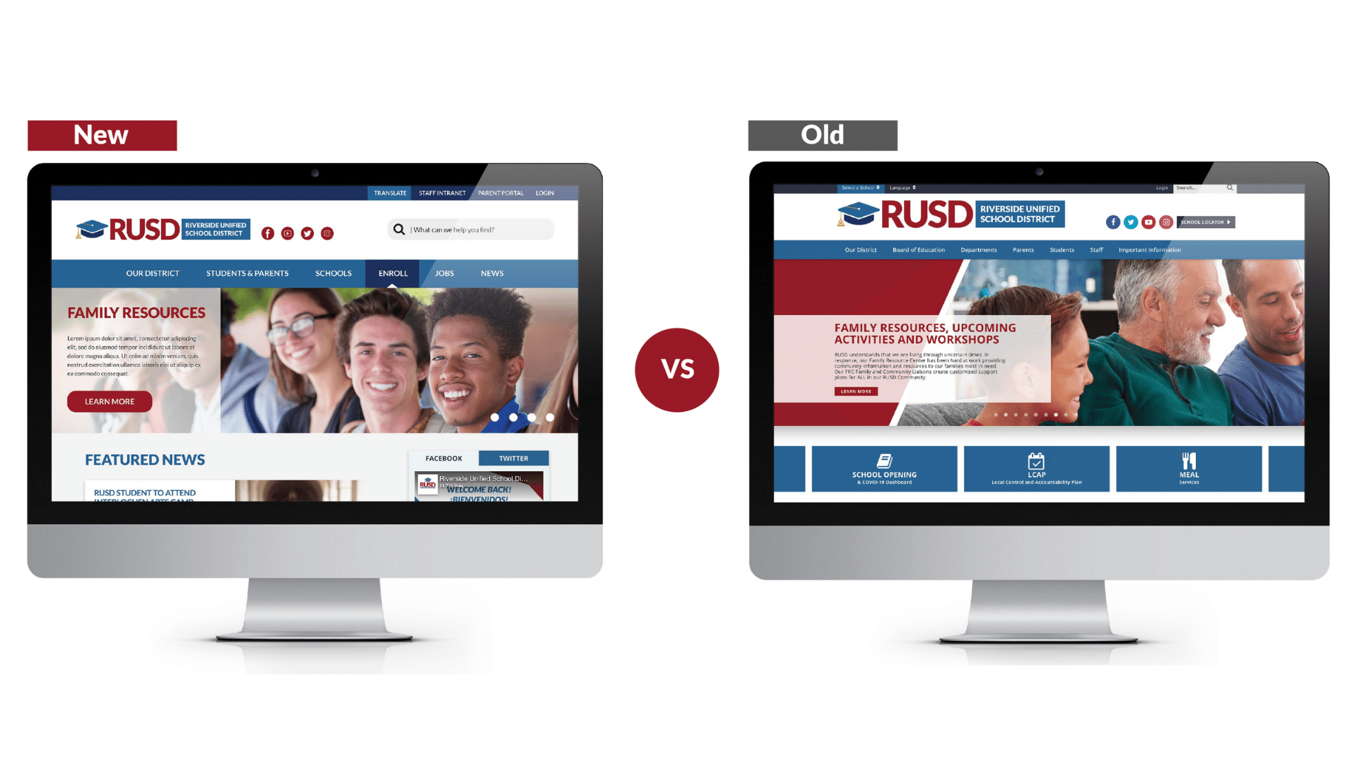
Pain Point Two: Difficult To Navigate To News
My solution to this was to make our news section more prominent. Our mission at RUSD is tied to showcasing important information and highlighting student success stories. We accomplish this goal by giving our news section a larger area and less visual competition.
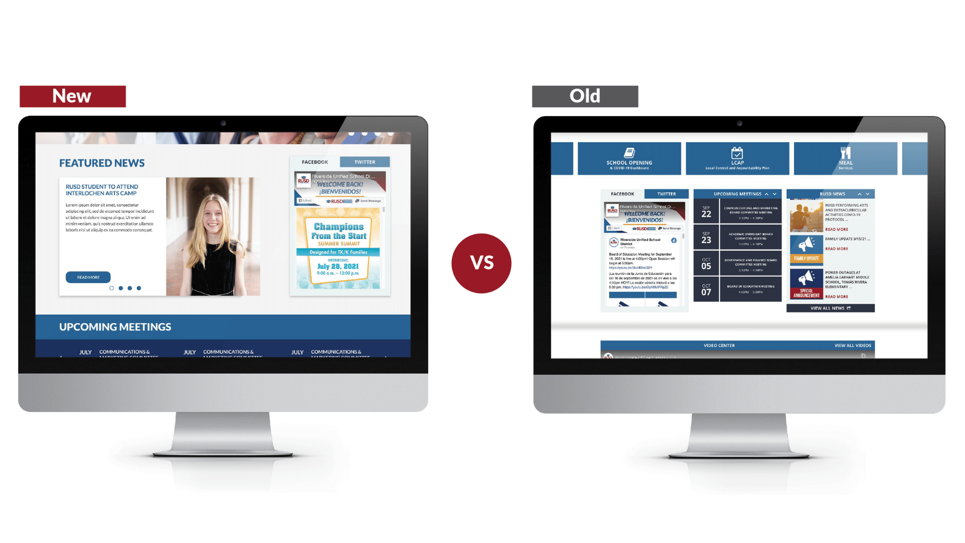
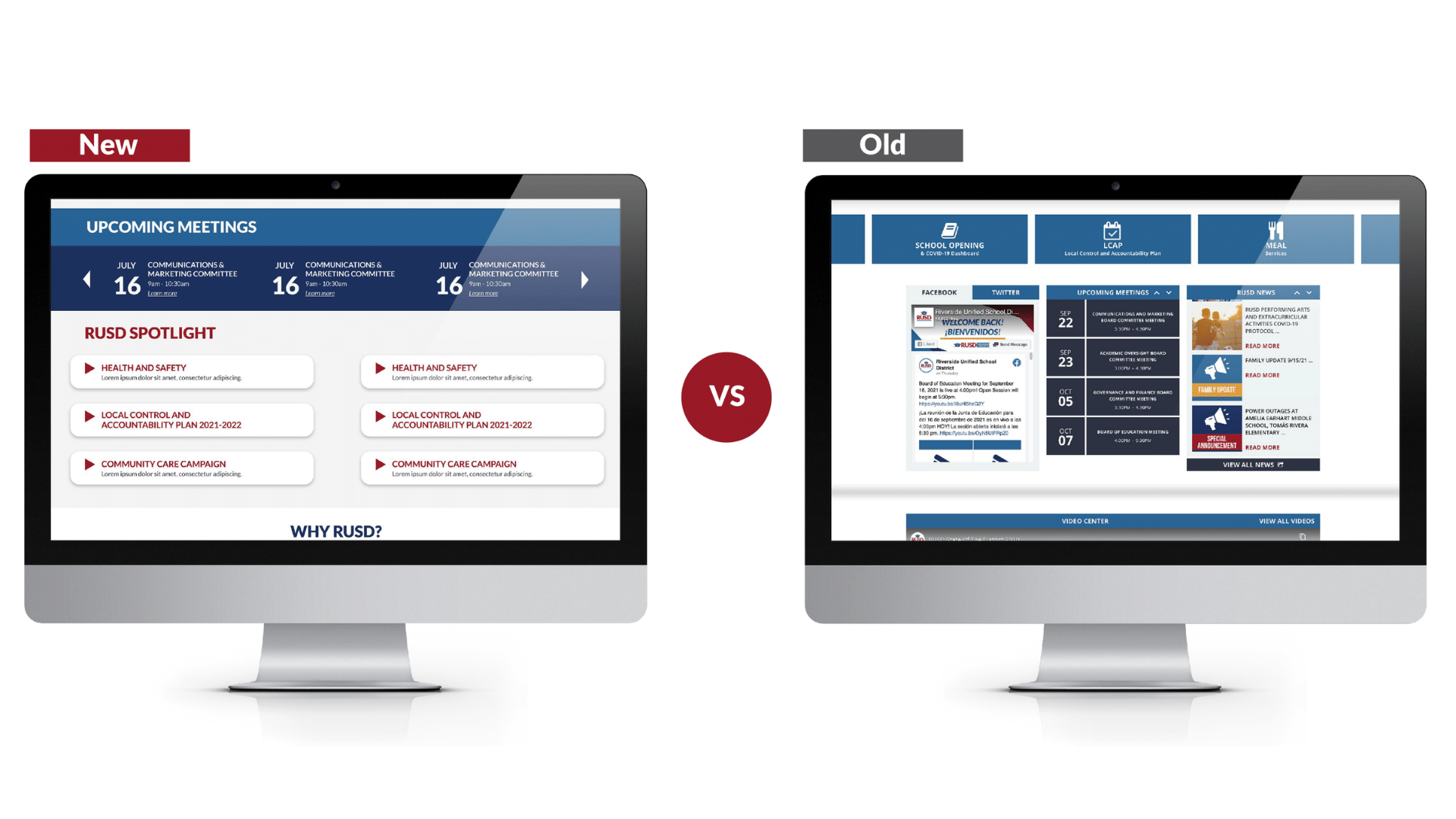
Pain Point Three: Difficult To Find Public Meetings
RUSD has received public feedback that our meetings are too hard to locate on the site. The new design solves this by making the meeting dates larger and reversed out, with a horizontal scroll that allows for every meeting to be shown without limit.
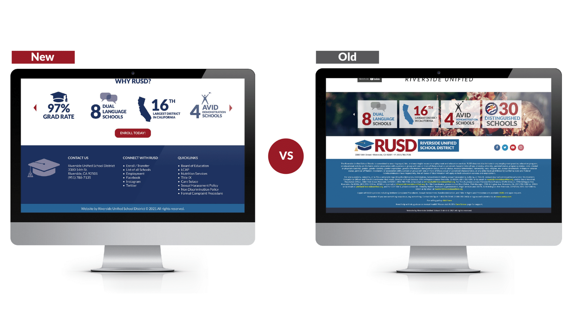
Pain Point Four: Too Much Language In Footer
The last homepage issue was related to how much content existed in our footer. This language is title IX legal language required to be accessible on the homepage. Instead of listing all of it in this location, we have revised the footer to include important quick links, including title IX that link out to pages for more information, optimizing the space and making for a better mobile and desktop viewing experience.
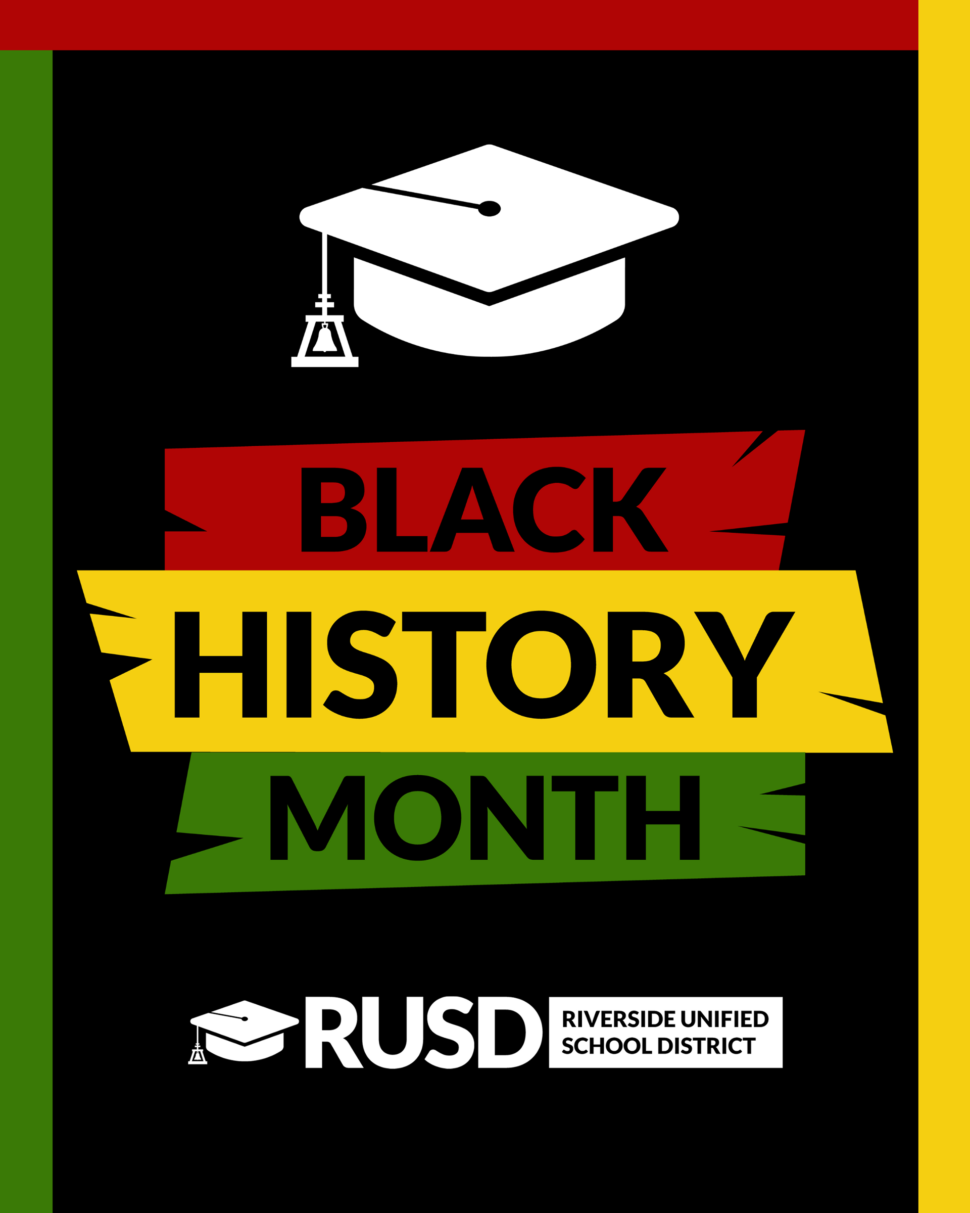
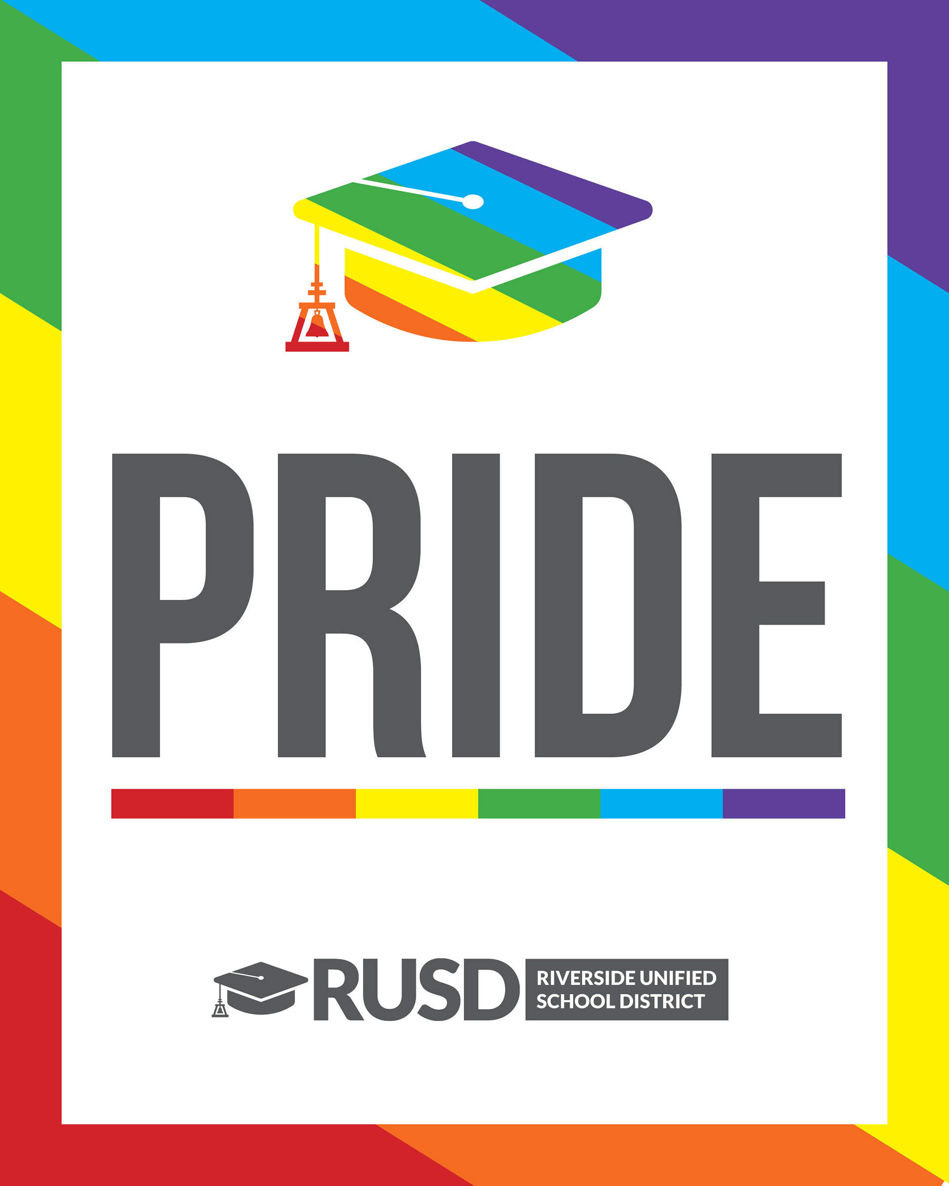
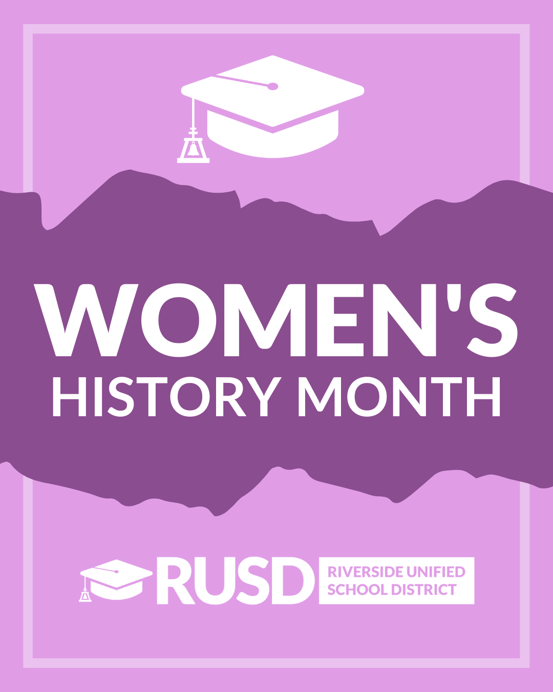
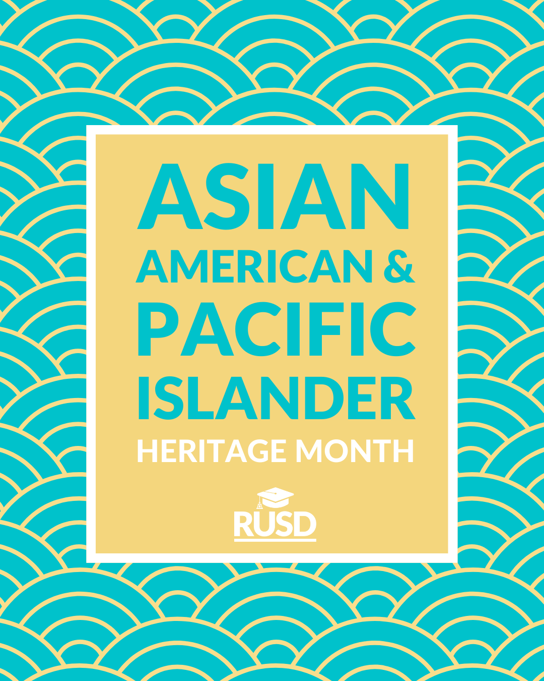
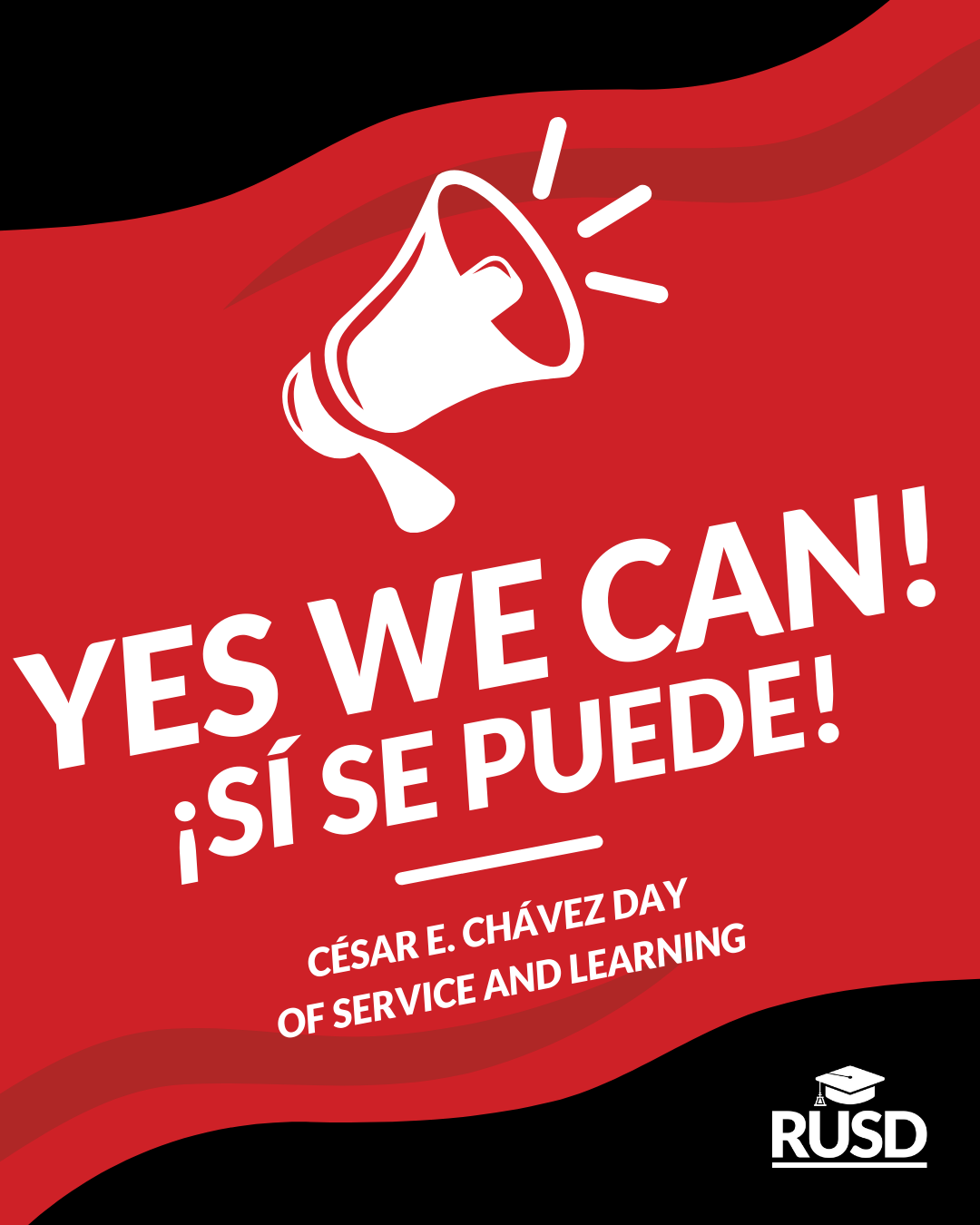
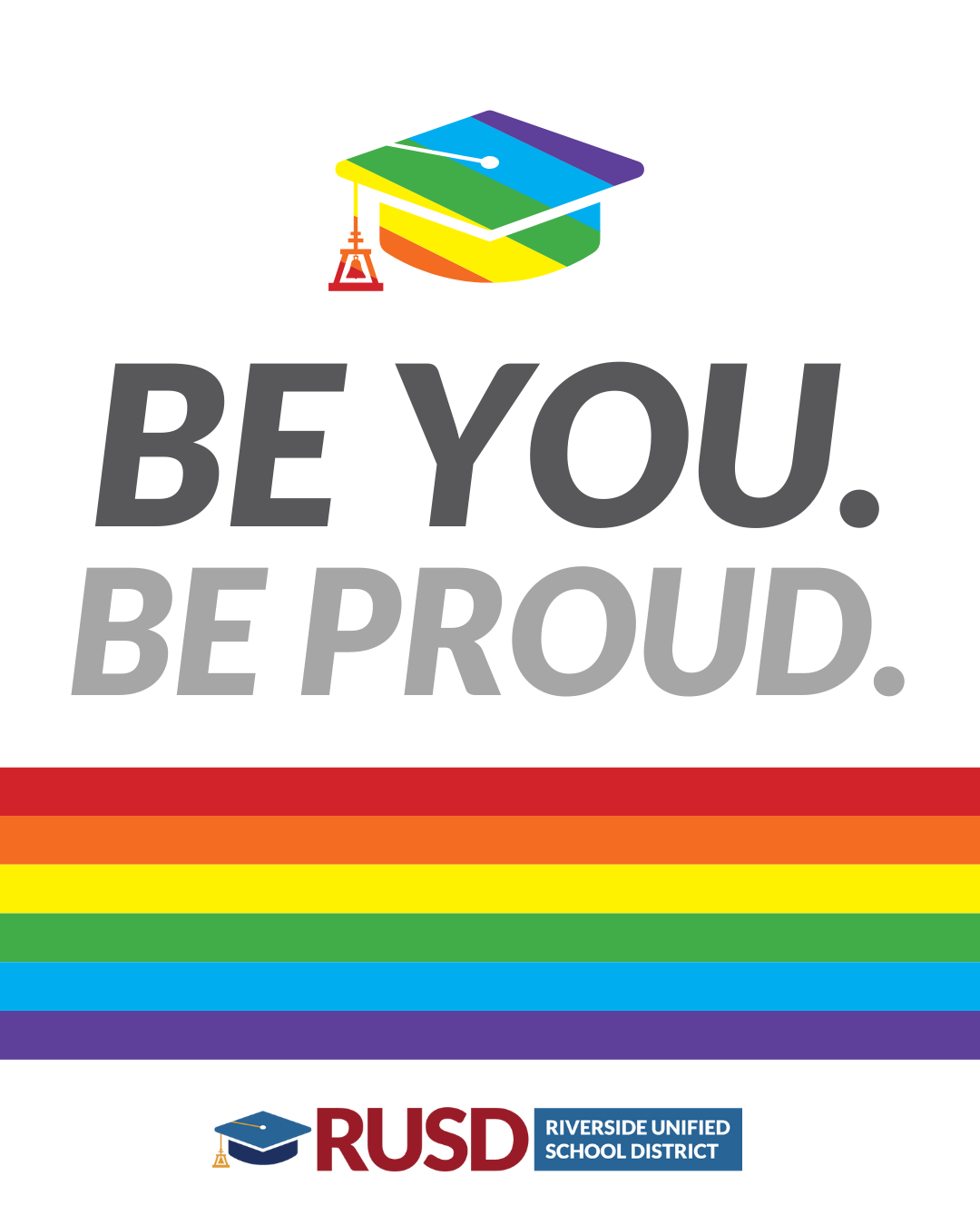
Equity

Nick serves as the RUSD Graphic Design and Digital Content Specialist and on multiple occasions has stepped into my role as Community Relations Manager when out of office or on leave. Nick is the ideal employee and is a fantastic member of our team. He is technically smart, creative, hungry to learn, humble, and demonstrates strong emotional intelligence. He is a wise investment to any team or project he is a part of! As a core member of the Communications Team, Nick intersects with nearly every area of District programming, events, and initiatives. The work he produces and guides directly shapes our District's and Schools' reputation, identity, and the clarity of our work as educators.
Richard Prince, Former RUSD Community Relations Manager